
Hypergram app redisigned
Redesigning a mobile hub for preset creation and creative connections
Timeline
Dec 2024 - Jan 2025
Role
UX/UI Designer
Timeline
Dec 2024 - Jan 2025
Team
Dominik Seibold
Vesselina Ivanova
About the app
Hypegram is a highly flexible creative tool, developed by a solo creator, designed for a niche audience of photographers, visual artists, and advanced creators — but also free for anyone interested.
Its core purpose is to enable deep experimentation with video and photo presets, giving users full control over editing parameters and visual effects.
The app offers a powerful yet complex set of features — including preset creation, recording, editing, and community sharing.
Project context
Built on the foundation of the existing Hypegram app and informed by competitor analysis, this case study focuses on enhancing its functionality, usability, and visual design.
The goal was to reimagine the app by introducing more consistency, structure, and improved usability, while also experimenting with adding a touch of brand character.
As part of the redesign, I created an Android version of the app, applying Material Design guidelines.
Impact
Several key usability issues were resolved
Further improvements were identified and added to the backlog for future iterations.Improved clarity and navigation.
Constraints
Limited development capacity
Legacy complexity
THE STORY
Reimagining Hypergram in four weeks
I took on this challenge to rethink and suggest a redesign of Hypergram. Knowing the creator is the sole developer, I was aware that implementing changes would be challenging.
My goal was to reimagine the app, define its audience and purpose, and explore its brand identity.
The app, first released in 2023, is still evolving with user feedback.
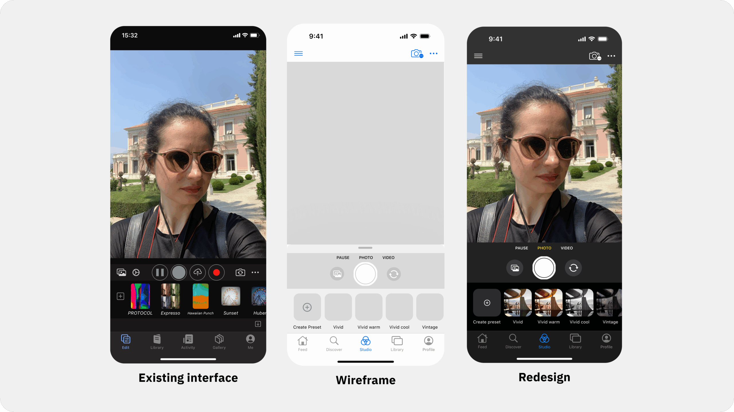
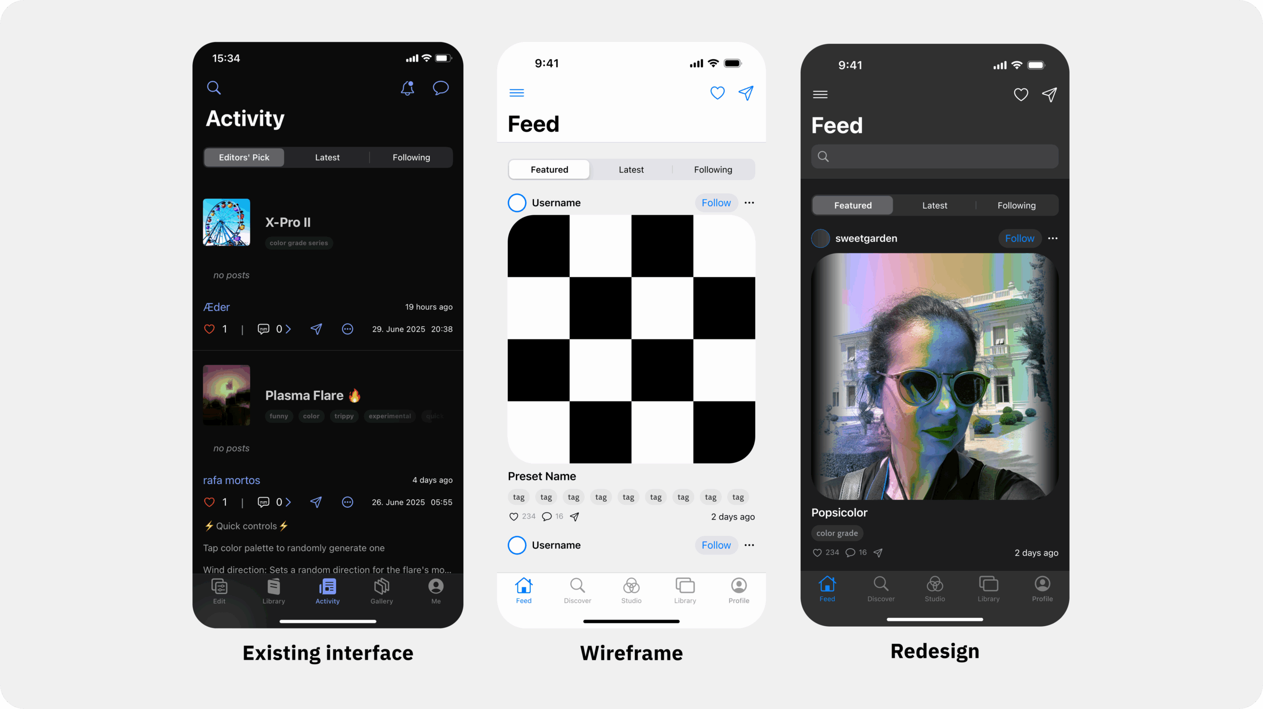
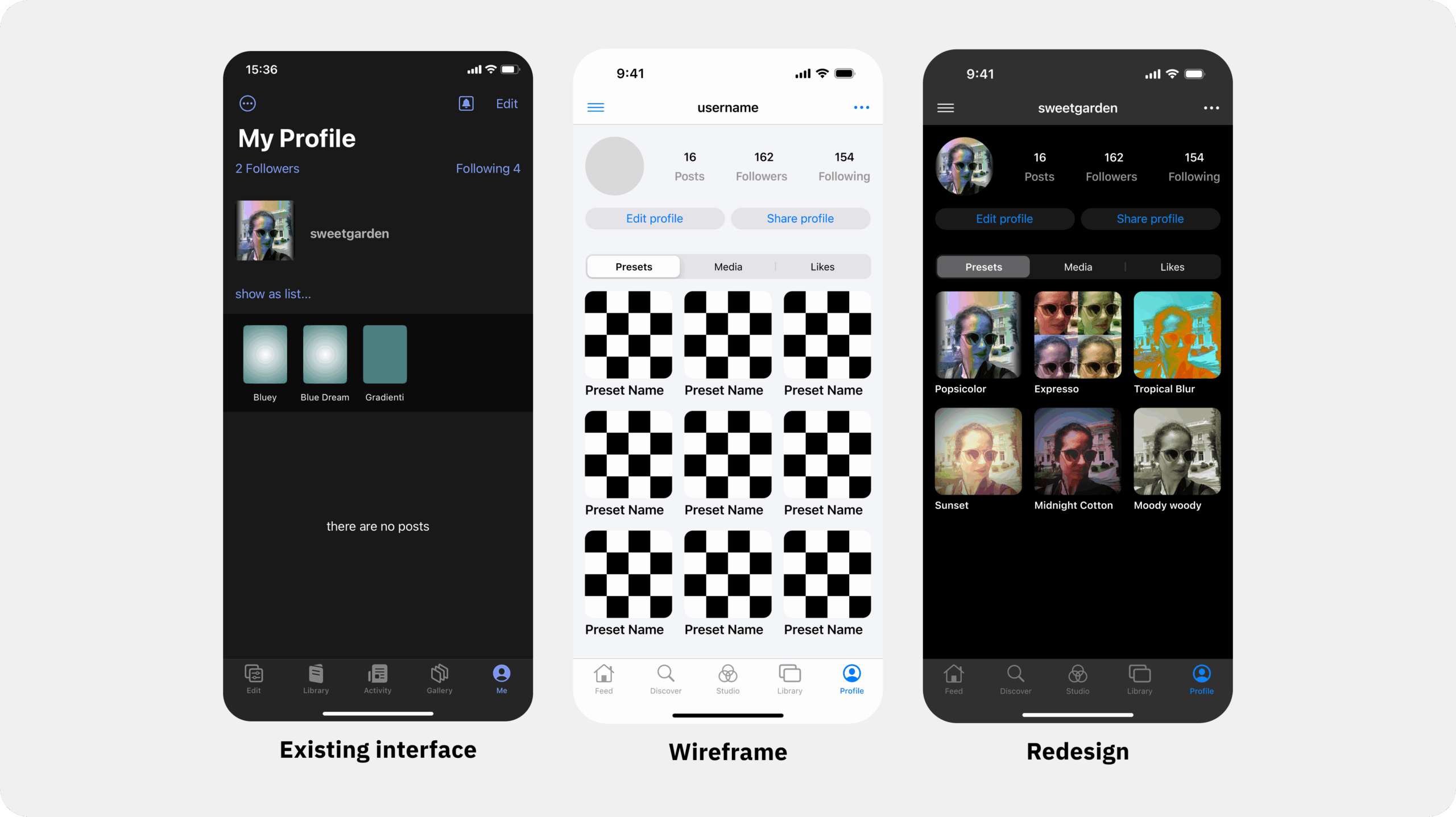
In about four weeks, I focused on three key flows — preset creation, community feed, and profiles — to improve navigation and clarity.

Redesign iOS
PROBLEM AREA
Powerful, but hidden: uncovering usability gaps in a feature-rich creative app
Hypergram is packed with powerful features—especially around preset creation and creative experimentation. But this strength is also its greatest weakness.
Problem areas
New users struggle to understand the app’s purpose.
Unclear where to begin or how to get started.
Difficult navigation due to many options.
Visually overwhelming interface.
Lacks clear entry points to core features.
Why it matters
This lack of clarity makes the app hard to explore and frustrating to use. Even though it offers strong functionality, many users are likely to abandon it before discovering its real value.
For the business, this means:
High drop-off rates
Low user retention
Missed opportunities to build a loyal creative community

Login screens iOS
THE APPROACH
Streamlining flows & elevating interaction design
I analyzed Hypergram’s current features and prioritized three key flows:
Preset creation
Community feed
Profile page
Using insights from similar apps, I simplified user flows and iterated from wireframes to screen designs, following both iOS and Material Design 3 guidelines for platform consistency.
The redesign enhances:
Usability
Interaction design
Adds sound and haptic effects — while retaining Hypergram’s core look.
Next steps include further refining interactions and elevating the overall user experience.

User flow reimagined
KEY STAGES
Solving for usability: redesigning Hypergrams’s core workflows
Redesigning Hypergram was a journey of discovery and problem-solving, focusing on functional design:
Understanding the Problem: Identified confusing workflows and buried features. Simplified core functions to make creativity intuitive.
Defining the Experience: Focused on three flows—preset creation, community feed, and profiles—streamlining navigation and clarifying purpose.
Research & Inspiration: Studied similar apps to adopt best practices like curated galleries and dynamic feeds.
Iteration & Refinement: Balanced aesthetics and functionality across iOS and Android through wireframes and testing.
Enhancing Interactions: Added haptic feedback, sound, and micro-interactions for a responsive experience.

Preset parameters
KEY LEARNINGS
Insights from redesigning a niche app
Redesigning Hypegram taught me the importance of balancing functionality with usability, embracing iteration, and following platform-specific guidelines.
I also learned how challenging it is to change an app’s structure when the developer is a team of one — big changes take time and effort.
To better understand the app, I asked "why" many times. Every design choice of the creator had a reason. Hypegram is a powerful, nerdy app, and that’s what makes it unique. Much of its structure is inspired by hardware and software tools with a long history.
The creator, Dominik, cares deeply about giving users maximum flexibility and precision when creating presets. I aimed to respect this in my redesign.
At the same time, the app lacked some basics: empty states, haptic feedback, clear icons, helpful text, proper spacing, and common design patterns. Fixing these will take more iterations and careful work.
Moving forward, I know that usability tests and user interviews will help guide improvements and ensure the app becomes even more user-friendly — while keeping its special character.
Selected Works
vesselina.g.ivanova@gmail.com
2025 Vesselina Ivanova